
2.5.19
Part 1, Project 2, Exercise 3, Section 1 – Creating shadow using lines and marks
- Pottery, part glazed jug


The first image was created with wet and dry charcoal powder, applied with a brush on a paper base with glued and ripped tissue paper to add texture to the background. I was not able to achieve fine lines, or much hatching to create any tone, the shading is largely in blocks.
However, my focus was to try and recognise the areas of dark, medium and light tone and not be distracted by the colour. There was so much variation in the glaze colour that it was hard, at times to work out what was tone caused just by light and shadow.
The second image used a fine pen on a similarly textured background. This had been prepared with newsprint, brown paper, tissue paper and graphite powder. The fine nib of the pen allowed for more subtleties of tones and hatching to create form and tone.


However, my focus was to try and recognise the areas of dark, medium and light tone and not be distracted by the colour. There was so much variation in the glaze colour that it was hard, at times to work out what was tone caused just by light and shadow.
I was curious about what would show as light and dark in a black and white photograph, having completed the drawings. It was good to do this extension having done the drawings to compare what I could see with what is shown in a toned photograph. I was relatively pleased that I did see and try to capture many of the tones.
I will do this with these subsequent exercises.
b. Small wooden box
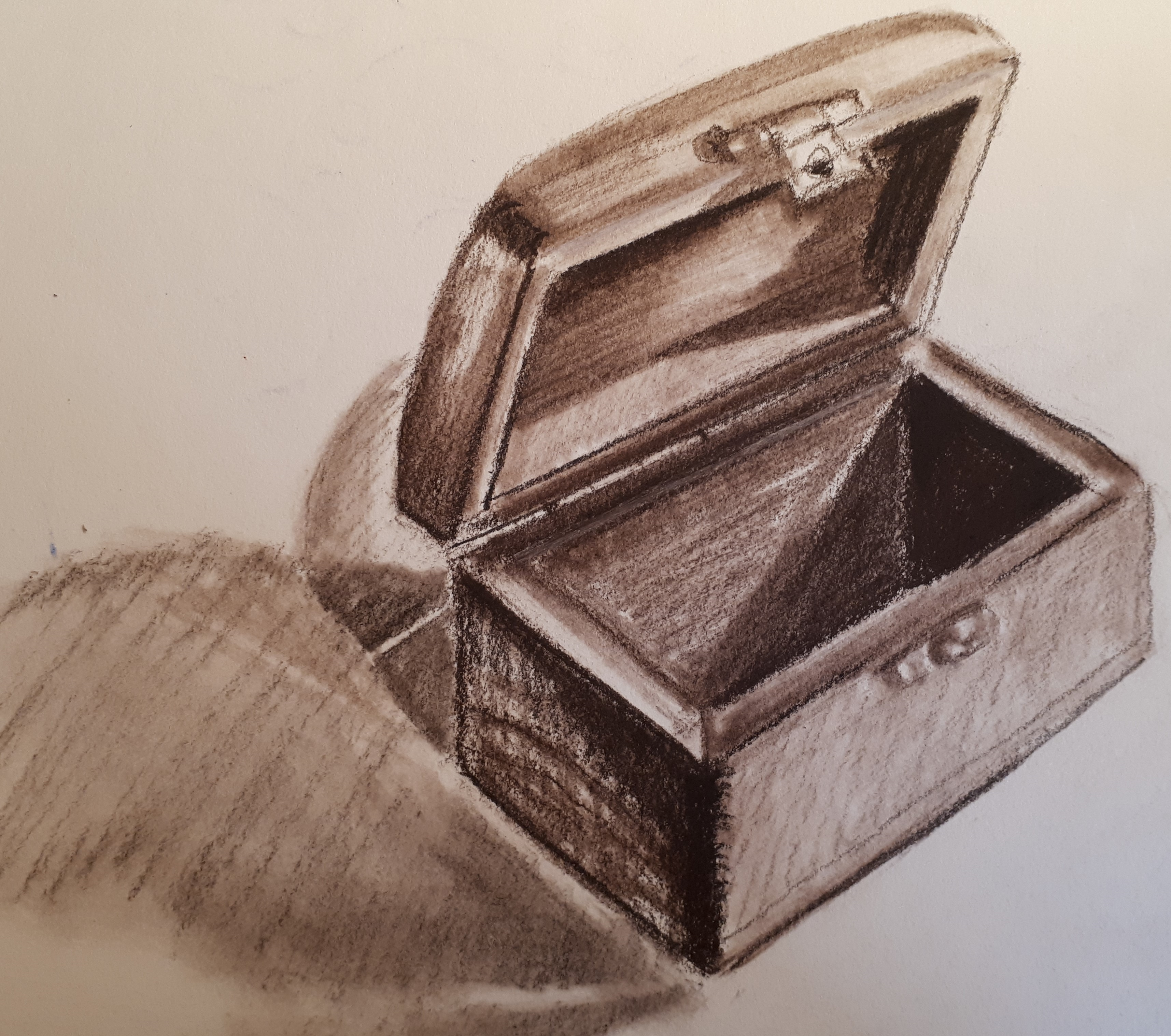
For this I used a wooden-drawing-lead-holder and two tones of brown creatacolor leads. I was able to get shading with hatching, but I did then blend some of the marks with a stub.
It was a small object and drawing and the marks made by the tool were relatively large.
I was surprised at how the tone changed even on one plane.


Again I was curious about how the tone would look on a photograph of the object. The photograph was taken from a slightly different angle, so the perspective is not quite the same as the drawing


For the second exercise I was keen to ‘try out’ conte crayons as I had not used them before for drawings like this, only on larger scale, life drawing classes. I used a black, and two browns. although I could ‘see’ the tone more easily on this one colour box it was still challenging to represent, particularly with such a chunky tool. I think I will try this again with a pen, perhaps a biro.
On reflection I think for this exercise I should not have done that, but left the raw marks.
Exercise repeated with fine black drawing pen:

With this version I was able to use hatching to achieve tone and variations in tone much more successfully.
Value of Exercise?
- Permission to draw just one object and look really closely.
- Not worrying about making an ‘interesting’ composition.
- Separating tone from colour
What did I learn?
- The variety of tones that can be found on one plane
- The softer drawing tools like charcoal and conte crayons did not lend themselves to hatching on these small scale drawings
- To not ‘fuss’ and accept that what I draw is ok. This is a learning journey and I don’t need to strive for perfection.
Future ideas and wonderings
- Enjoying the excitement of ‘just drawing’ and not worrying what happens.
17.5.19
Part 1, Project 2, Exercise 3, Section 2

Drawing a small collection of objects, using the skills built up from the previous series of exercises, using lines and marks to create form.
I chose this dip pen and drawing ink medium as I knew it would force me to be more decisive about my mark marking using hatching and cross-hatching to create and suggest form and make the objects more believable as 3D shapes.
I was conscious to try and minimize the drawn outlines where possible, and did try to vary the pressure and in places just suggest edges of shapes by the direction of tone lines. However, where the shape really stood out from its background (ie. the pestle) the lines were stronger and bolder.
I chose items with a range of textures and that would reflect and absorb light differently.
Value of Exercise?
- To choose a suitable media and explore the effects of creating shadow using lines and marks.
- To demonstrate prior learnings about creating tone, in a composition with more than one object at a time.
- To show the relationship between objects, considering composition, negative and positive shapes and how the objects, light and shadow relate to and impact upon each other.
What did I learn?
- Again I am surprised by the range of tones in the shadows, and the reflected light within the shadows too.
- I enjoy using pen and ink as a drawing medium.
- This was a quick drawing to do, and although I drew a framework for it in pencil, it was rendered without fussing about perfection, readily in ink.
Future ideas and wonderings
- Try using white ink on black paper.
- Might I be able to use black paper and white ink as a part of my assessment for this unit?
- Continue to explore how to create form without necessarily using outlines everywhere.
