
Research 2, Project 1 – Composition
Positive and Negative Space
Look at a range of artists working today and see how they incorporate positive and negative spaces in their work.

Gary Hume: I had never heard of this artist before but he is considered to be one of the YBA artists.
This image ‘Cerith’, 1998, is a graphic-style screen print at the Tate Gallery, but is based on an earlier painting that he had done using household gloss paint. This screenprint did remind me of some of Warhol’s celebrity prints with large simplified blocks of colour.
The form is really simplified and positioned in the middle of the artwork. The yellow, negative space, around it creates a visual frame. The golden yellow is not quite the complementary colour of blue, but together the two colours do off-set each other to make this a particularly bold image.
Attention is drawn initially to the perfect circular dot on the cheek in pink. I would not know this was an image of a man, and indeed the pink circle would probably sway make me to think it was representing a female, despite the blue skin and short dark blue hair. It is androgeneous. Knowing however, this is an image of a man, it seems unlikely that this circle is an earring and yet it is not quite in a position the viewer might anticipate for a cheek? I also wonder why he chose to make this a more representational colour than other aspects of this artwork.
The white primitively drawn wide outlined eyes become the next focus. They too seem a little feminine. They stare straight at the viewer. In contrast to the rest of the image, they are the only hand drawn aspect of the artwork.
There is no delineation in the positive shape of the face, to indicate where the face becomes the neck, and yet the positioning of the eyes being in line with the top of the ears suggests that they are positioned accurately within the solid block of colour that represents the skin tones. The artist leaves it to the viewer to find where one form might become another.
Despite the bright block colours the balance of positive and negative space makes this feel quite a calm piece of work.

Elizabeth Blackadder: She is a Scottish painter and printmaker. I have been to an exhibition of her work in Edinburgh and I must confess to being confused about why some of her work is held in such high esteem. I primarily struggle with her choices about the use of positive and negative space in her pictures.
In 1980’s she visited Japan and her artwork was apparently influenced by this visit. Wikipedia claims that:
‘her work depicts the principles of Zen which give paramount importance to the idea of empty space’ (Wiki)
I appreciate I am very much a novice in evaluating artwork and can only comment on what I like or not and why, so I do hope that my views here do not offend.
This work feels like a ‘shopping list’ to me, or something laid out on a grid, very functional and lacking emotion or energy. There is no physical relationship between the objects, and many of them are unidentifiable. They are supposed to be ‘on a table’ and yet the plane of that table seems at odds with the objects laid upon it. The objects appear to be floating as there is no shadow and there is nothing to suggest that these objects were even laid out at the same time as there is no sense of light and shade, and consequently I feel they lack any notion of three dimensional form.
Whilst I am sure there was a lot of consideration about composition, I am really challenged by this and feel it is unsatisfactory. Maybe that is the intention, to challenge the viewer?

There are fewer objects in this second painting, (Flowers and Red Table, 1969 (oil on canvas)) but there are many similar aspects to the other work. The objects are laid out with a lot of space between them, apparently, again on a flat surface, the perspective of which seems at odds with the objects upon it. There is only one example of an object slightly overlapping another, and once again the items appear to be floating as there is no shadow. Ironically perhaps the bottle has the most form as there is evidence of shadow on it and light hitting it. Again it feels very linear, and this is echoed in the horizontal lines across the top of the painting.
The aspect I like the least is the painted red table. The red colour seems to be somewhat crudely painted around the objects. It seems naive. The choice of colours is odd too with muted toned objects on the right and then two garishly coloured objects next to each other on the left. It lacks unity and balance and feels energyless to me.

By contrast John Bratby’s paintings might be considered ‘exuberant’ and buzzing with energy. He fills these pictures and the more you look at them, the more you see. The eye is restless trying to soak up the detail, trying to decipher the story. What is this place and why does it look like it does? It generates emotions of the place feeling ‘unloved’, uncared for. There is very little negative space, and it also feels as if there is very little air. Perhaps it is the context, but the air that is there feels a little stale.
This painting ( Kitchen II, 1966) shows the inside of a working class house kitchen, traditionally the heart of the home. However, I am not sure whether the house is derelict, being renovated or is lived in. There are so many questions about it. Filling the image with so many shapes thereby using the positive space, makes it feel animated, but it is almost exhausting to look at. He has created a clever sense of visual space, and used colour and tone to suggest depth in the painting… through the door, around the corner, through the window, in the cupboard…

In this second Bratby painting (Sir David Frost) it is busy, but in a different way. It is reminiscent of some of Matisse’s interior scenes with strong colours and lots of ‘patterns’ created by the leaves. I do not know what the association is with the plants and Sir David Frost, but the artist certainly suggests there is a connection. Do the empty chairs in the background represent guests he might have welcomed for interview throughout the years? He takes advantage of negative spaces to build his story, even if the viewer does not necessarily understand the plot line. The positioning and body language of the sitter in the bottom corner feels like he is somewhat uncomfortable and being squeezed out of the painting which is being overrun by these trailing leaves, and the pot-plant which seems to be reaching towards his face.
The bright colours and use of the positive space does again create a vibrant and animated picture.
Looking at the work of these three artists I can see that having a lot of negative space affects the pace of each painting. It can be used to create a relaxed or frenetic image. However, there is certainly a tipping point in these examples, where too much space, along side other artistic choices, impacts the whole ‘experience’ of the artwork, to the point where too much space, ceases to generate or hold interest. I wonder if this is just true for me, and for these particular examples.
I can, however, think of other landscape/seascape paintings I have seen where muted colours and simple suggested lines really do create a calm and contented feeling, so I know this cannot be true in every context. Might it be a more significant factor in still life art perhaps?
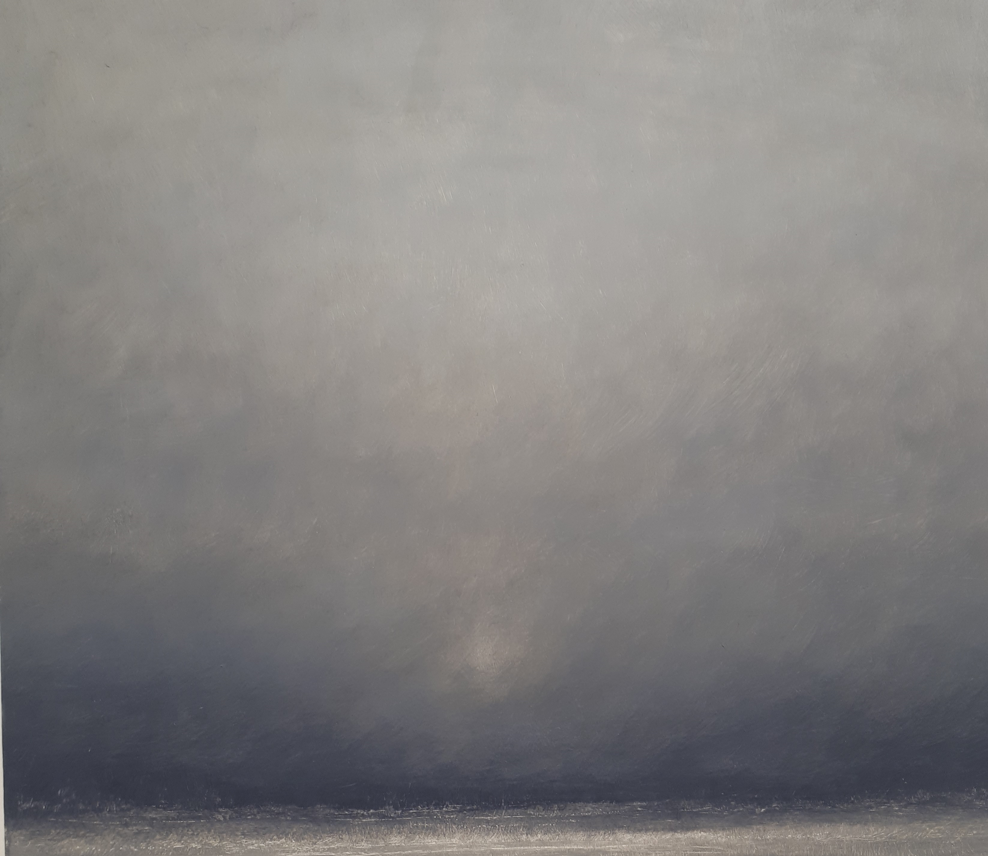
This minimalist painting with muted neutral colours, although a landscape rather than still life, does evoke a particular feeling of calm.
References:
Blackadder, Elizabeth, (1969), Bridgemann Education, [online]. Available at: https://www.bridgemaneducation.com/en/search?filter_text=bratby. [Accessed 29.7.19]
Blackadder, Elizabeth, (1931), Table with small objects’, Bridgemann Education [online]. Available at: https://www.bridgemaneducation.com. [Accessed 29.7.19]
Blackadder, Elizabeth, Wikipedia, https://en.wikipedia.org/wiki/Elizabeth_Blackadder Accessed 29.7.19
Bratby, John, (1966), ‘Kitchen II’, Bridgemann Education [online]. Available at: https://www.bridgemaneducation.com. [Accessed 29.7.19]
Bratby, John, (1967), ‘Sir David Frost’, ArtNet [online]. Available at: http://www.artnet.com/artists/john-bratby/portrait-of-sir-david-frost-7ZlFw6tucGNbc3iCVXsOgg2. [Accessed 29.7.19]
Hume, David, (1998), ‘Cerith’, Tate [online. Available at: https://www.tate.org.uk/search?aid=2403&type=artwork [Accessed 29.7.19]
