
31.5.19
Part 1 Gesture and Form

Composition:
Having selected a range of ‘special’ items, I spent some time exploring set up of the objects.
After the first attempt I quickly recognised that the boots should be on an elevated platform and my initial thoughts were to perhaps have them on a shoe box. On reflection, I thought the print and designs on the box might be too distracting and quite irrelevant, diverting attention away from the key objects.
I then tried them on a platform under the fabric, before deciding that showing the wooden crate was more interesting and would allow more potential for texture in the artwork, given the requirement to reflect our textural studies in this assignment piece.
I was not comfortable with the boots simply together, or ‘head-on, but found that placing one boot at a tipped over angle created more visual interest and some interesting negative space between the boots.
Having experimented further, I wanted the figurine with her back to the light so that shadows would fall on her front and help allow for the creation of an effective 3D form and some contrast.
There was also need to have sufficient negative spaces and yet balance these with some inter-relationships and visual connections between the objects. I was seeking an arrangement that didn’t feel too contrived or convenient.
Learning from previous exercises, I was keen to have at least two items ‘fall’ out of the frame. The ‘family’ sign and the sculpture book lent themselves well to this. There was enough information to know what the objects still were and recognise their significance.
In choosing to include the box of oil paints, I wanted to acknowledge how much ‘art’ is a fundamental part of my life, but was also aware that paints and brushes probably are the most rendered item in this exercise. Consequently, I was keen to push the paints to the back of the picture, not because they are the least significant at all, but just to acknowledge that for everyone who chooses to study a BA Painting degree it must surely a ‘given’ significance!

Having narrowed my compositions down to a couple of preferred ones, I then drew quick sketches of them at A4 size. At first, getting the scale correct again, and filling the page as I hoped proved to be very challenging, as did working out where the edges of my drawing might be, and how to ensure the selected items ‘fell-out’ of the frame. After a couple of unsuccessful attempts at this, I created an A4 ratio view finder, from card and acetate, marked up with grid squares. This made an enormous difference to ‘seeing’ where the edge of my picture would be and checking on positions and relative proportions. It wasn’t until I inked up one of these A4 sketches that I recognised I had ‘over-done’ the negative spacing and needed to tweak a couple of objects to make them visually overlap.


Inspiration
Some years ago mixed media artist Ian Murphy was invited to work with the children at school. I also had an opportunity to participate in his workshop. Since then I continue to be inspired by his textured, atmospheric backgrounds overlaid with detailed monochromatic drawings incorporating a superb range of mark making. http://www.ianmurphyartist.com/drawings-gallery/.
This gave me the inspiration to try a few textural experiments of my own on my base paper.

Drawing Surface and drawing media

Content now with my composition I wanted to experiment with surface textures, aiming to incorporate a range of textures within the surface of the paper itself as well as on the surface using a variety of drawing media.


On the paper surface I applied newsprint text (no colour or photos wanted) from a Spanish newspaper, brown paper, tissue paper, black sugar paper, gesso and polyfilla.
I gave some consideration to my composition in positioning these papers. I wanted the brown parcel paper to be in the upper left corner to echo the texture and colouring of the wood panels of the room, and possibly newsprint or black paper where the figurine would be.

In the meantime I experimented with what drawing materials, if any, would be effective on black paper. I tried acrylic inks, which seemed very effective as well as some chalk and oil pastels and a Chinese white drawing pencil.
Once dry, the papers were sanded and partly peeled off to give a more ‘derelict’ textured and hopefully ‘interesting’ background. On two papers I rubbed over graphite powder and on the other charcoal powder. The charcoal powder was very dark, and I concluded it would make drawing on top of it, at this scale, too challenging. The graphite powder created enough of a base tone layer. It would allow me to rub out highlights, something I had found very effective in previous exercises.
The next step was to experiment with what media produced the most interesting effects on what surface and to make a note of these. Here are my findings:
- Make sure to put some scrap paper under my drawing hand so that the hand does not smudge the graphite powder more as I am working.
- The dipping ink pen and drawing ink were particularly effective on the tissue paper surface. I resolved to glue tissue paper where I planned to position my boots for the actual assignment artwork.
- Charcoal is effective on newsprint.
- The conte crayons and charcoal were good on the brown paper.
- The dipping ink pen was good on polyfilla but not good on the gesso as the ink sat on the the plasticised surface and didn’t soak in for a long while.
- Thicker, permanent drawing pens were effective on the gesso.
- White conte and chalk were good on the polyfilla surface and newsprint which had been grayed with the graphite powder.
- Rubbing out with a rubber and electric rubber were good on the newsprint, white paper, gesso and polyfilla.
- The polyfilla and gesso would also need to be sanded for the assignment, but with care, to keep some of the textures.
- Conte worked well on all the surfaces.
- The black permanent and non-permanent pens were not good on the loose charcoal powder as it clogged their nibs.
- The permanent pens, charcoal and oil pastels were not effective on the tissue paper, as there was not enough contact with the surface of the paper, and the pens bled too readily.
Having more of an idea what drawing materials were best suited for what surface I was keen to ‘get started’. Now I had to prepare the ‘final’ papers with regard to where I positioned the collaged papers to best suit my composition.
The Assignment Drawing

I decided to stand to draw as it would encourage me to make my work looser, quicker and more instinctive. I find it more tiring to stand, and the work is certainly different and less ‘tight’ than when sitting. I also chose to make this an A3 piece of art. I thought it would mean I could use a smaller drawing board, angle myself more ‘infront’ of the still life and it would generally be more manageable. The size did create challenges when using ‘chunkier’ drawing mediums like charcoal. The charcoal pencils with their finer points were more valuable for this reason.
However, I also hadn’t realised that using a dipping ink pen is a very different experience when you are standing rather than sitting, and gravity helps drop the ink on the floor rather than allowing you to mark-make relatively effortlessly on the paper. This was frustrating and unanticipated.
I tried to carefully consider the weight of the lines in the drawings as I progressed, making those in the foreground bolder. The choice of materials was also considered with this in mind. However, in reality I found myself jumping between all the possible media and sometimes using two or three, or even more on a single object. That became quite experimental in itself and ultimately instinctive.
At some point all the drawing materials I had used throughout the unit have been used in this one drawing.
- pencil
- graphite sticks
- charcoal, compressed and natural sticks
- charcoal pencils
- oil pastel
- chalk pastel
- dip pen
- acrylic ink
- drawing ink
- putty rubber
- chalk
- Chinese white pencil
- Edding fine black pens
- permanent drawing pens, fine and medium
- graphite powder
- Conte sticks and pencils
- electric and conventional rubber
Initially I was concerned that the drawing would be too dark, but I think it does work and the texture and tones make for a more interesting drawing that you have to work at to ‘see’ all that is in it.

I decided that rather than using any ‘colour’ media in this final drawing the colour would come from the brown paper. Using colour on any one item might have made that item take precedent over the others. Colour has been used in conte crayons in earlier exercises throughout Part 1.
Value of Exercise?
This Assignment 1 drawing aimed to offer an opportunity to demonstrate and combine learning from all the individual exercises within the unit. Additionally it also gave me free choice of what to draw. I was encouraged to select items that had particular significance to me.
What did I learn?
I learned:
- the value of doing preparatory investigative and exploratory work before making the commitment to create the final piece of artwork
- fully explore optimum compositions
- consider a variety of drawing surfaces
- think about texture and pattern in the surface of the artwork at the planning stage
- be adventurous in the media choices and consider mixing different media together
- try out different media effects on different surfaces before committing it to the artwork
- think of maximising tonal contrasts in the composition stage to help create a sense of 3D forms
- consider if the drawing will have a coloured background and/or you might use coloured media
- how to use weight of line and tone to create a sense of depth
- to keep working at a drawing even when you are not totally sure it is going to work out in the early stages
- dip ink pens are not such a good option when standing up as the ink does not flow so well as when sitting.
Future ideas and wonderings
- instead of just reaching for a plain piece of white paper for an exercise, consider other possible options
- consider drawing with more colour medium
- consider using coloured paper as a base
- consider using more than one type of drawing medium in subsequent artwork
- can you ‘draw’ with a paint brush, or is that ‘painting’? This is a recurrent wondering, and one I must evidently explore further through professional reading and research.
Why I Chose These Items
Figurine by Annie Peaker (http://www.anniepeaker.co.uk/about.htm)
I love making ceramic figurines and have been on four residential 3 and 5 day courses with Annie. She is an Internationally renowned potter. This ‘Streetlife’ figurine, in particular, has proved to be an inspiration in my own pottery making. This figure is so graceful, lithe and well proportioned. I can appreciate the years of experience that allow her to create such a piece. The texture is a regular feature of her work, but this relatively subdued palette allows the viewer to fully interact with the character without the distraction and over fussiness of worrying about colours being in particular places.
Waking boots
We live in a beautiful valley in the Alsace. Every day, in an effort to stay active, my husband and I walk. We aim to get more than 10,000 steps each day, but at a weekend, take pleasure to enjoy a longer walk, perhaps though the woods, or into Basel (about 12km), around by the horse stables, or through local farms… Spoilt for choice.
Figure Sculpting Book
This is a reference book by Phillipe Faraut. He is an amazing figure sculpture who is also keen to share his knowledge of the form and structure of the body and how to represent it in clay. The photos in this book are aesthetically beautiful and the knowledge he shares is fascinating. He shares much more through his You Tube channel (https://www.youtube.com/channel/UCkYpixj95KNsWMByDcYrcaA)
Sketchbook and pen
I do carry a sketchbook with me everywhere, but am often too intimidated to pull it out in crowded contexts. However, I will be working on over-coming that through this course. Sometimes I am struck by an image I feel compelled to draw, and other times the book is a ‘working out’ space. I do like drawing in biro. It is very instant, can’t be rubbed out and allows for a wide variety of mark-making, from the faintest of line through to a dark, inky blackness.
Box of oil paints
I have only recently purchased these oil paints. I have long wanted to try out oil painting, but do not really understand how best to use them. I have watched numerous on-line videos, and enjoy watching Mark Carder. (https://www.youtube.com/user/DrawMixPaint) I know his work is slow and precise, and I would hope to work in a looser, more instinctive way, but he does share so much that is valuable for a novice like me. He tends to specialise in still life paintings.
Another artist I enjoy watching is Andrew Tischler. (https://www.youtube.com/user/AndrewTischlerArt). He is particularly good at portraits, but also demonstrates landscape paintings.
These cobra water-mixable paints seem the least intimidating form of oil paints, and with their minimal odour, are certainly the most practical for me. I have tried a few small paintings and really like how long the paint stays wet and can be reworked. I am keen to build my knowledge of this medium throughout the course.
‘Family’ sign
Our family, in particular, my husband and our five daughters are at the centre of our lives. The girls are gradually leaving home and moving on with their own lives. After this summer we will just have one daughter still at home with us. We love hearing from them, and love it more when we get to see them. Being here for them and learning from them is such a constant delight. They had to be represented in this artwork of ‘what is important to me’.
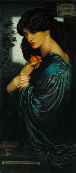
Pomegranate
For the past year, together with one of my daughters, we have been vegetarian. We eat a lot more fruit and vegetables, and the pomegranate is perhaps my favourite of all. It also represents one of my favourite classic artists, Dante Gabriel Rossetti. He is considered to be a Pre-Raphaelite artist, and his painting ‘Prosperine’ prominently features a pomegranate.
( https://www.wikiart.org/en/dante-gabriel-rossetti/proserpine-1874 )Three of our daughters also have the thick, long red, wavy hair that is such a distinct feature of many of the Pre-Raphaelite paintings.
Spanish newspaper
This is used in the texturing of the background. It creates a lovely memory of a city break to Barcelona, and represents our love of exploring new places.
References:
Carder, M. (n.d.), YouTube, ‘DrawMixPaint’. At: https://www.youtube.com/user/DrawMixPaint . (Accessed on 08.06.2019)
Faraut, P. (n.d.), YouTube, ‘Phillipe Faraut’. At: https://www.youtube.com/channel/UCkYpixj95KNsWMByDcYrcaA (Accessed on 09.06.2109
Murphy, I. (n.d.), ‘Drawings Gallery’. At: http://www.ianmurphyartist.com/drawings-gallery/ . (Accessed on 08.06.2019)
Peaker, A. (n.d.), ‘Annie Peaker Ceramic Artist’. At: http://www.anniepeaker.co.uk/about.htm. (Accessed on 09.06.2019)
Rossetti, D. G. (2019), WikiArt , ‘Prosperine’,At: https://www.wikiart.org/en/dante-gabriel-rossetti/proserpine-1874 (Accessed on 09.06.2019)
